Anthony Libecci spearheaded
the TOP SELLING sales office
for Aflac for 4 consecutive years.
He wanted to branch out with his own company.
and he called this eBenefits.
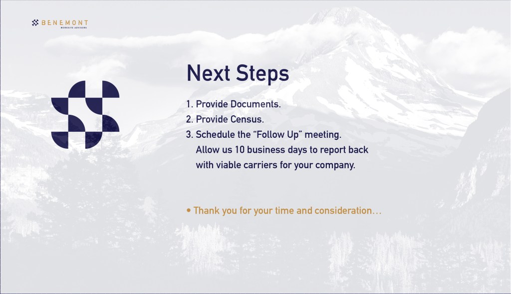
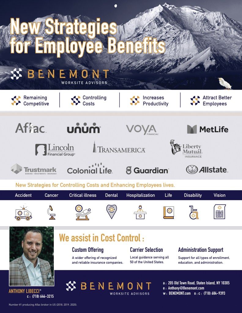
We did their logo and
designed a poster.

Then he wanted to
branch out again with
a whole new name.
We wrote 300 unique company names (shared them with the client/patron) and together we cut them down to just 10 options.
Our favorite was “BENEGOD” however, this patron chose BENEMONT. So we went with that.
BENE, in Italian means “Good.” And, “Mont” means “mountains“.
The domain was also available. So, we acquired that too.
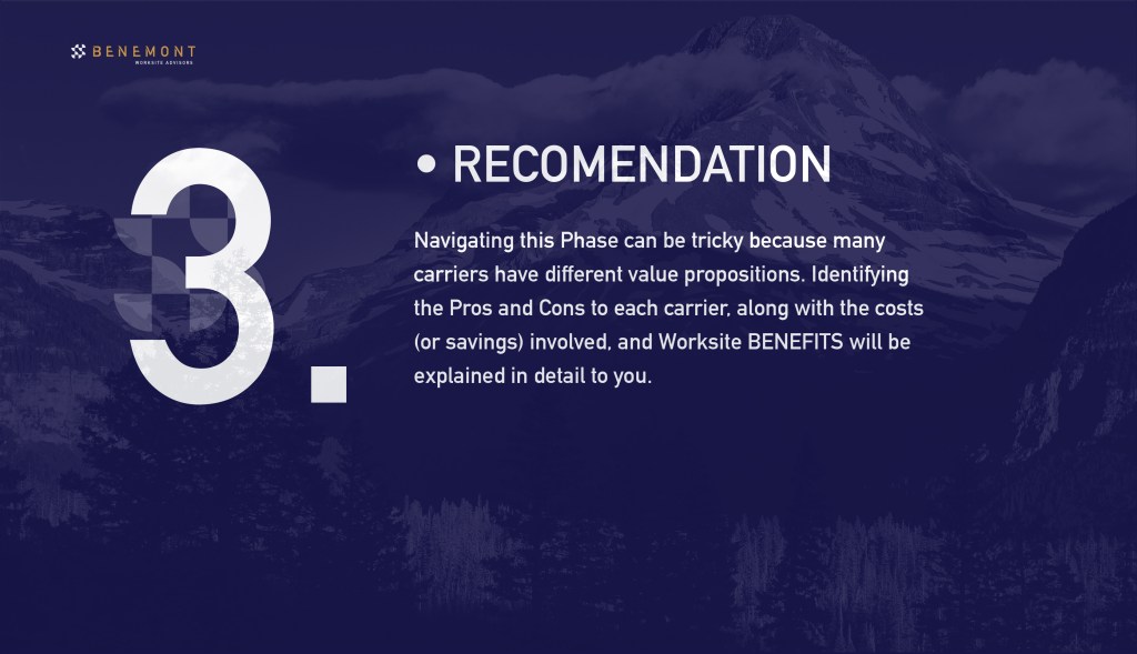
Next, we had to come up with a logo:

The Checkered ICON 🏁 was reminiscent
of the Checkerboard flag 🏁 we all see
at car racetracks. 🏁










Then a few years later the client/patron
wanted to alter the BENEMONT logo’s icon
to something that would give the feeling
of a people company.
We did that and also ran
a social media campaign
to test it.



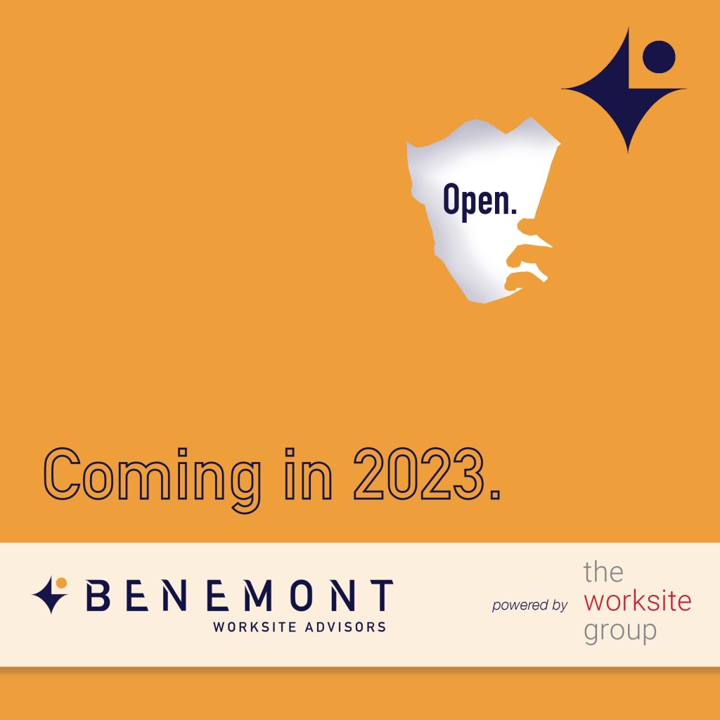
Mr. Libecci had opted to do
a strategic partnership with
another benefits company
called the worksite group.
This meant changing the color palette, iconography, for both companies, which we did for BENEMONT and theworksitegroup.
We designed their Graphic Standards.


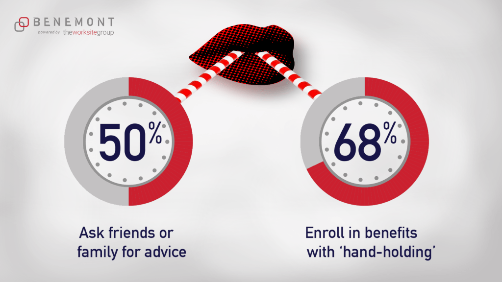


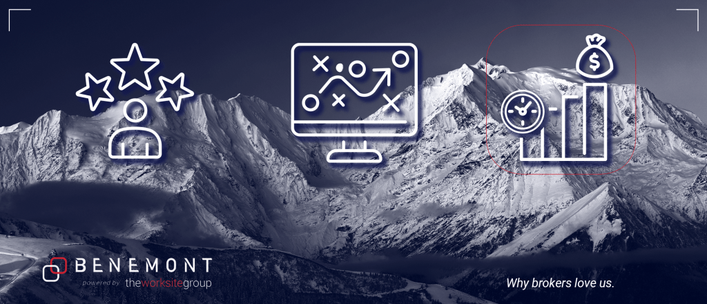
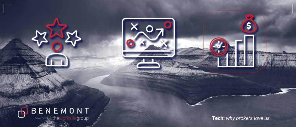
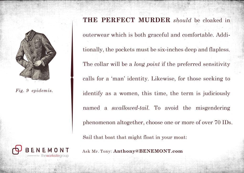
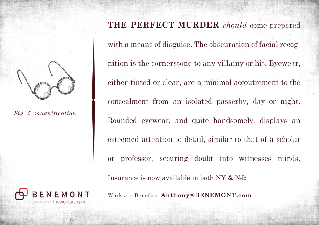
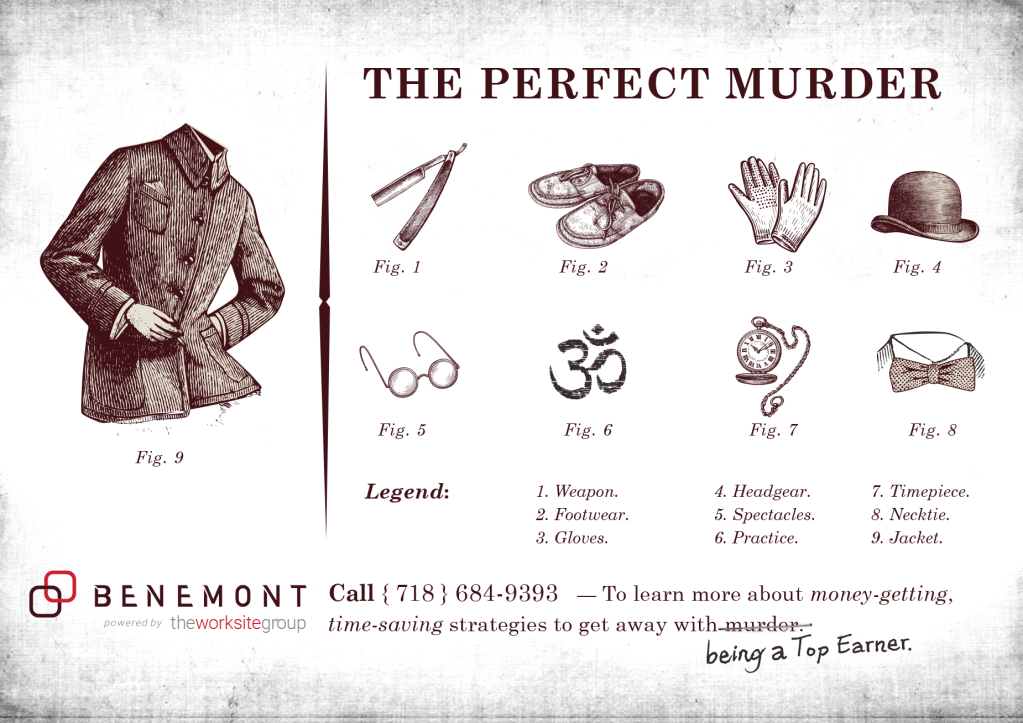
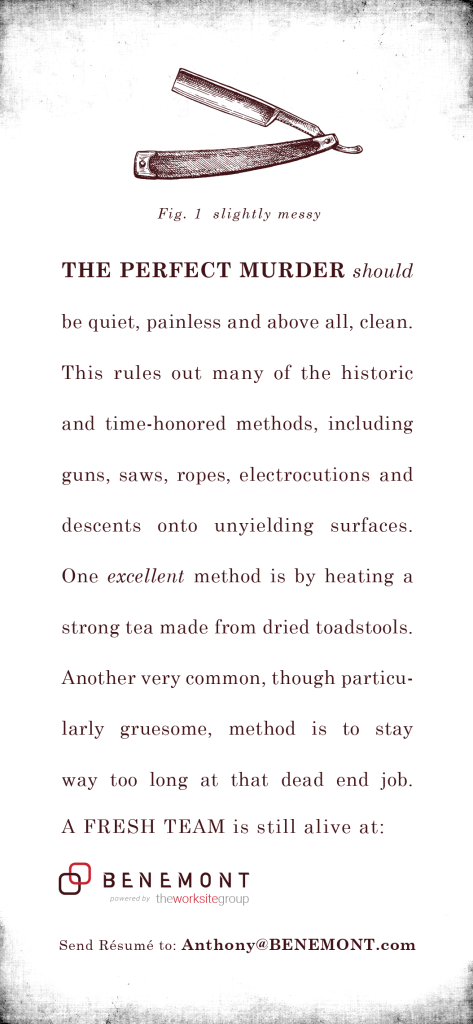
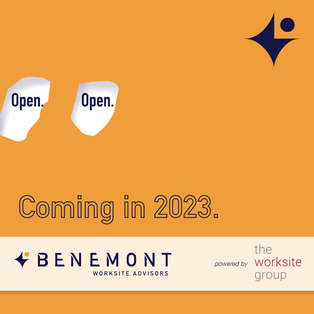
Then our patron wanted to hire more brokers and we took things in an entirely new direction.
After releasing the campaign, a few months later, the worksite group, asked wanted. They found it too dark.
This campaign did attract and
generate all the brokers who
were like-minded and had a
propensity toward a dark sense
of humor. It was a success.


